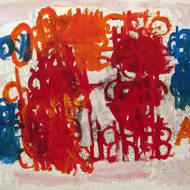
A conversation between Erin Somerville (Deputy Director/Curator at White Columns, NY) and Martin and Rebecca Eisenberg
ES: I’d like to begin by asking you both to say something about the exhibition’s title: where it came from, how it occurred to you to use the phrase, and how, for you both, it relates to works in the exhibition. Did you select works once you’d determined the exhibition’s title, or did you have artworks you wanted to include and found a title that fit the exhibition you were developing?
ME: Many months ago while driving in the car with Rebecca, she suddenly leaned her head back, closed her eyes, let out a deep breath, and uttered the phrase “Calgon take me away.” It’s a line that I’ve heard her say many times over the years. It comes out during moments of stress. Being married to me for over 30 years, and having three children, causes these moments to come up rather often. I immediately said that’s the name of our next Riverview show.
Rebecca, please tell us about the Calgon ad campaign which goes back to the 1970’s and why it still resonates for you.
RE: A beautiful dark haired woman, hair swept up, sinking into a bath filled with bubbles murmuring, “Calgon take me away,” had me mesmerized as a little girl. Somehow sinking into a tub filled with these luxurious bubbles would make everything as wonderful as she was.
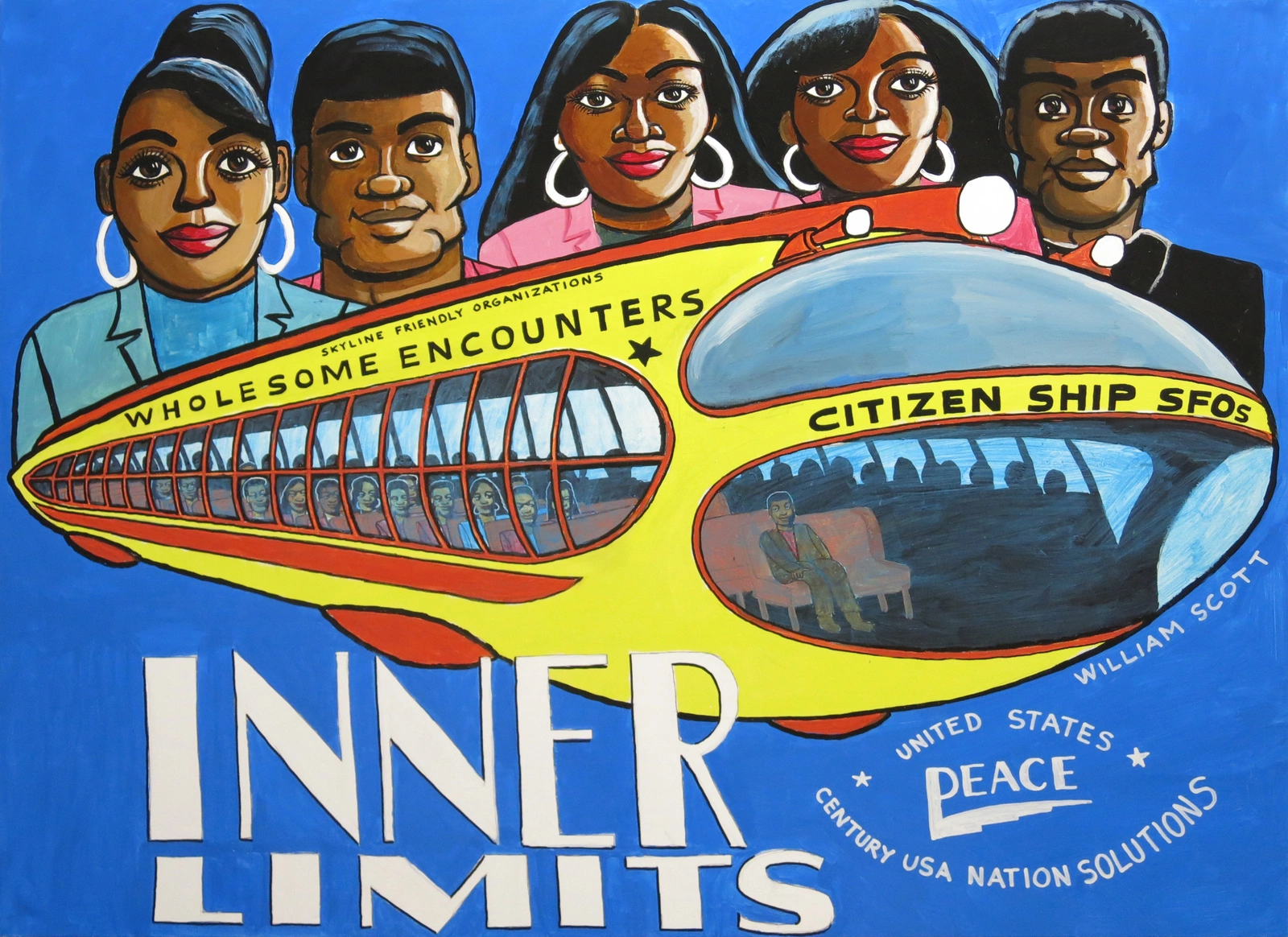
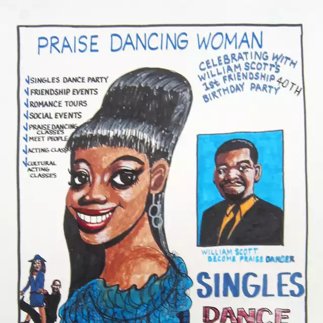
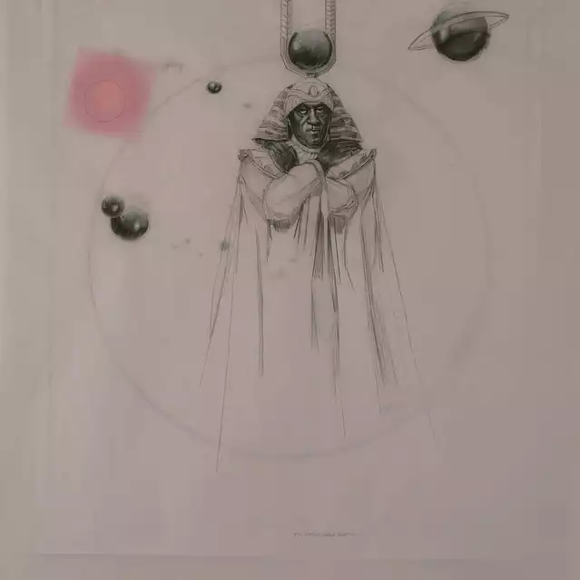
ME: That description of the Calgon commercial is perfect. After deciding to build a show around that idea we picked out the artworks. The Calgon bath is about being transported. The first piece chosen was the painting by William Scott featuring his Inner Limits space ship (The Twilight Zone, 2014). That signature work set the rest of the show in motion.
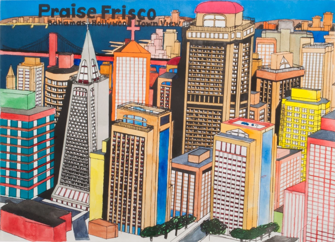
ES: It’s interesting, and a little surprising, to hear that William Scott’s The Twilight Zone was the first artwork selected for the show. That and his other work, Untitled (Praise Frisco Print), both seemed initially like outliers in the exhibition - but Rebecca the description of the impression the ads left on you as a child does make sense with Scott’s work - Scott’s idealistic reimagining of the city of San Francisco.
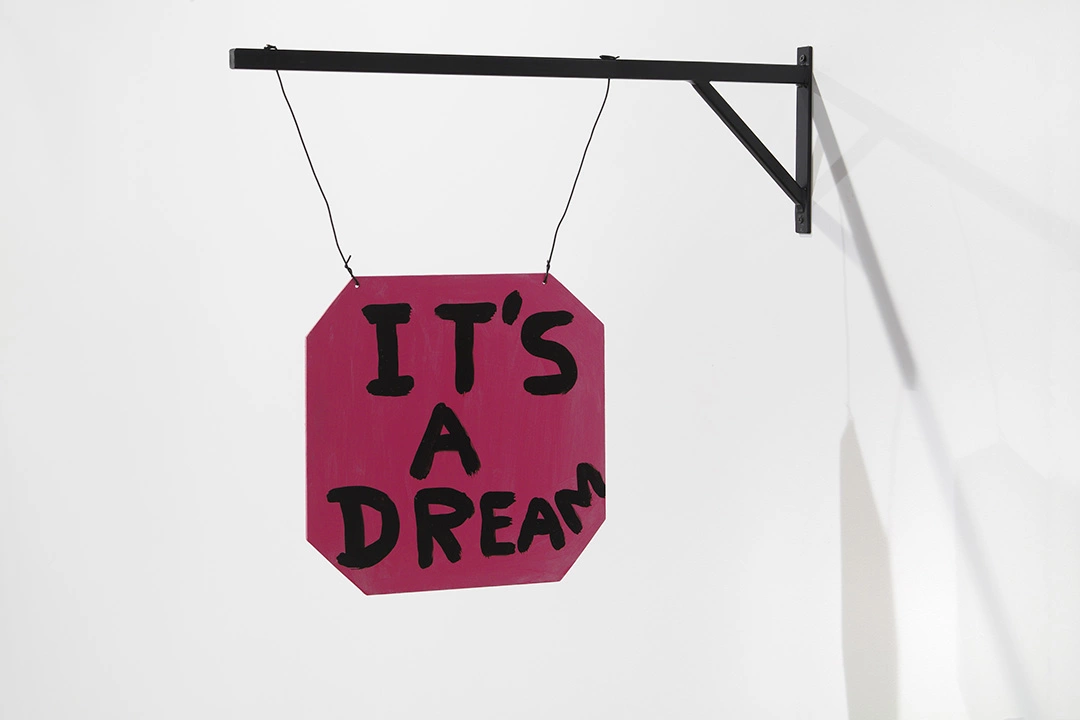
How did you proceed from there? And it makes me think of another work in this show, David Shrigley’s It’s a Dream. This piece is a really great example of the artist’s work, and is probably truly the antithesis of the sentiment of the show’s title, which is why it’s so great that it’s included. Is that in line with your thinking?
ME: The whole show is about being transported to another place, even if you haven’t changed locations. In the case of Shrigley, dreams transport you, so the sign It’s a Dream seemed perfect. In the case of William Scott’s Untitled (Praise Frisco Print) it is his idea of a new San Francisco, one free of crime, poverty, and other elements that William wants to see erased. It’s the ideal city of his dreams. Rebecca and I bought the Shrigley piece but we have yet to find a spot to install it in our home. Breaking it out and seeing it in the Riverview School has been so much fun. The students are going crazy over it. So far it’s the hit of the show
ES: I’m curious to learn more about how you go about curating exhibitions together. Being part of a curatorial collective myself, I know we took a while to refine our process. I’m assuming you’ve worked on exhibitions together before (though I could be wrong!) and from your description of how the title came to be it sounds like it might be a more organic process, coming from your day to day lives.
ME: It’s totally organic. Same way we built the collection. Dinner table talk, car rides etc. I will bounce ideas off of Rebecca and she will join in when she’s feeling it. Many of the best works we’ve purchased were because Rebecca believed in a show or an artist. In the case of this exhibit, I can tell you that Rebecca pushed hard for many of the works and artists, including William Scott, Fred Tomeselli, and Anne Collier. I came up with the concept of the show from Rebecca’s obsession with that Calgon commercial, but her influence runs deeper than that.
ES: I’ve witnessed those exchanges! Where Rebecca is very sure of an artist or artwork, it’s impressive. I like these examples of artists this has happened with - William, Anne, Fred - it’s a diverse list, they all have very different practices. Rebecca, could you say anything about why you wanted to support these artists in particular or what drew you to them? Why were you drawn to their works which are now on view in this exhibition?
RE: I know these three artists personally. Marty and I met William while visiting Creative Growth Art Center, the artistic day program in Oakland, CA for adults with disabilities. When he was given a solo show at White Columns in NY in 2006 I met his family who were extremely proud of him. It was very moving as they never thought this type of opportunity was possible. His ability to make work that depicts idealized places and peaceful loving encounters in such a relatable way, makes me want to jump right into his pictures and go there with him. I am proud to say, due to our donation, William is now part of the MoMA’s permanent collection.
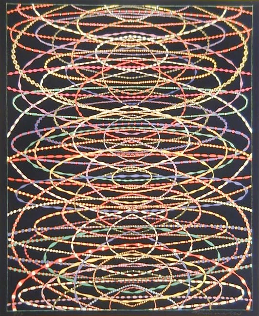
We first saw Fred’s work in the early 90’s at Jack Tilton Gallery. I was immediately drawn to it: beautiful patterns made out of marijuana and later gorgeous constellations made with any pill imaginable. This is work that can transport you anywhere, literally and conceptually.
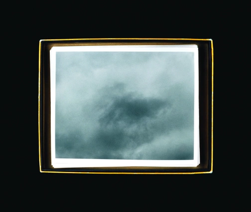
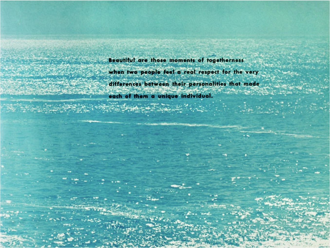
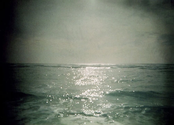
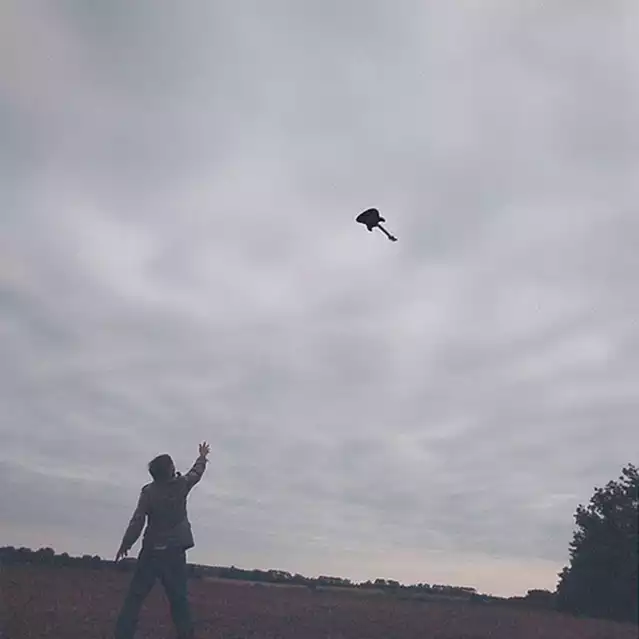
Anne is a personal friend. To me her photography is captivating and thought provoking. The two examples in our show depict the ocean and sky, places that not only enable one to be physically transported by plane or ship, but also spiritually through self-reflection.
ES: Rebecca, your description of Anne’s work touches on the dominant motif throughout this exhibition - landscape. You have some very different approaches to this theme in the show, by artists like Anne Chu, Roe Ethridge, John McAllister, Nikolai Noel, and Rashid Johnson. Marty, can you speak further about these works individually and in relation to each other, and maybe about this theme overall?
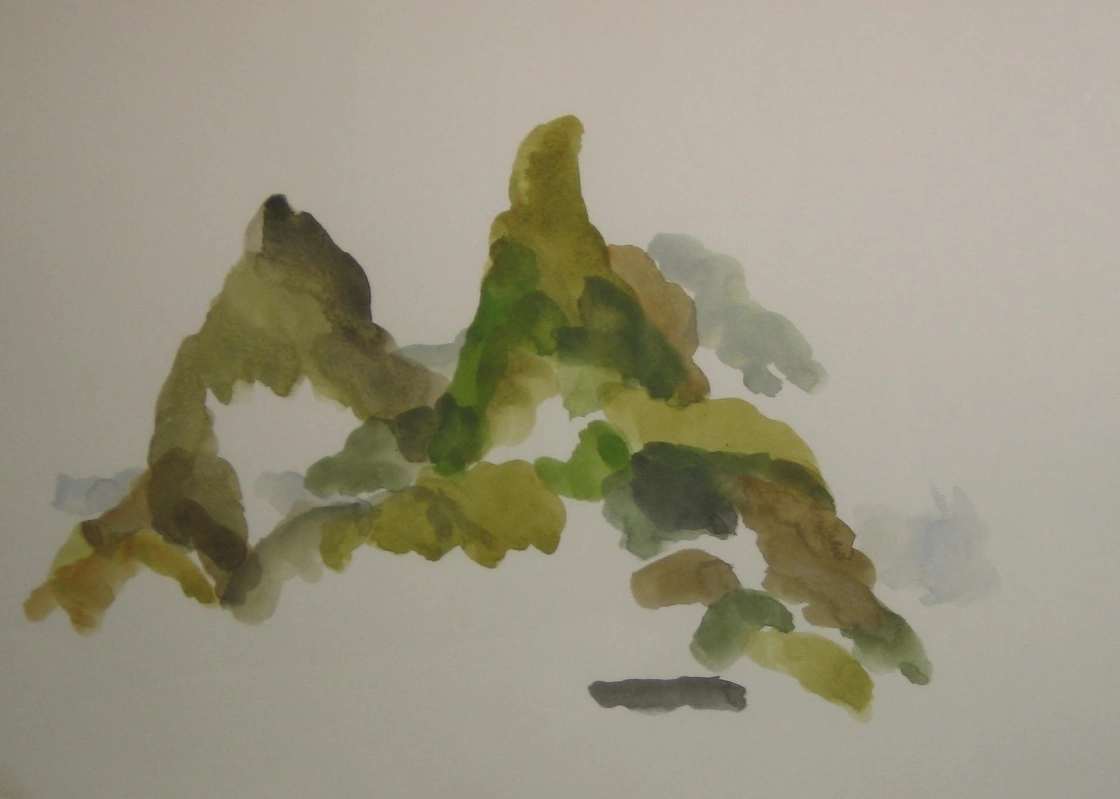
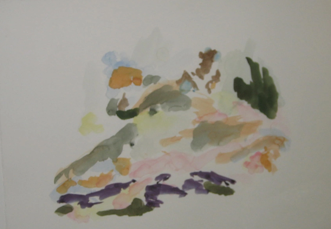
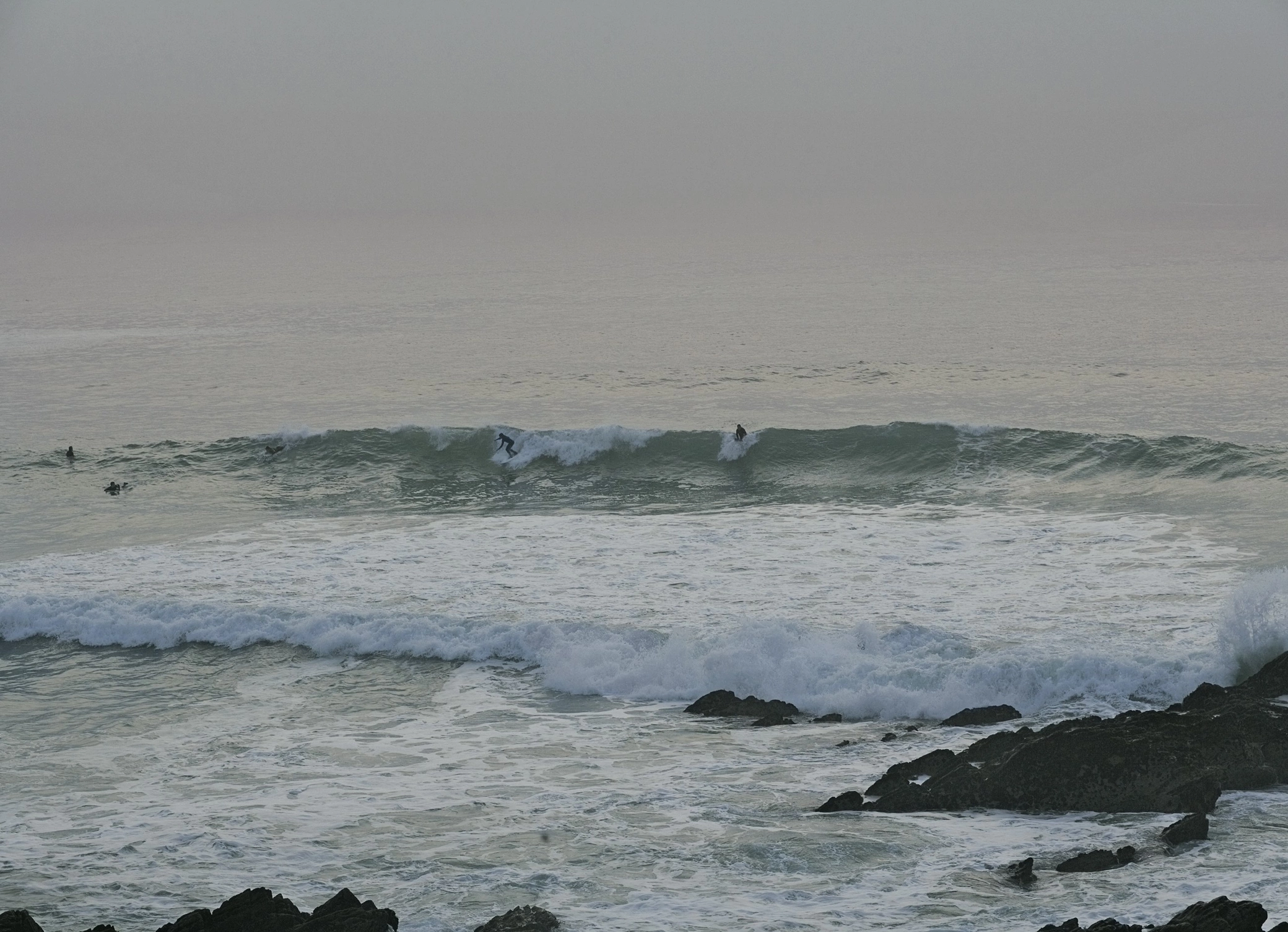
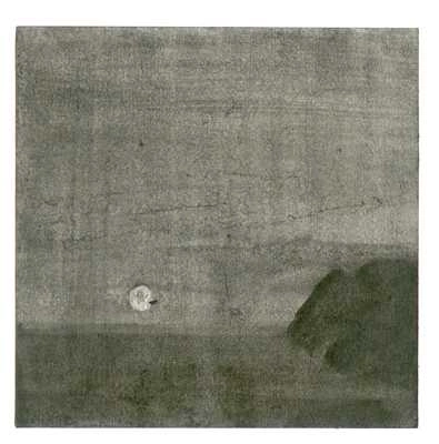
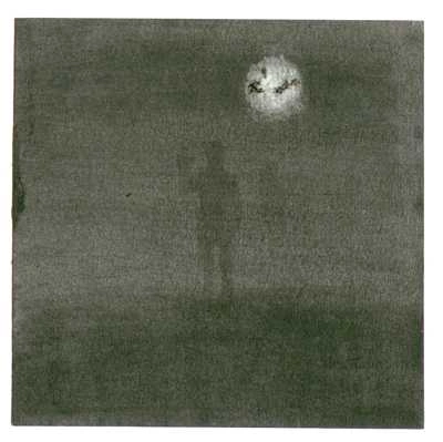
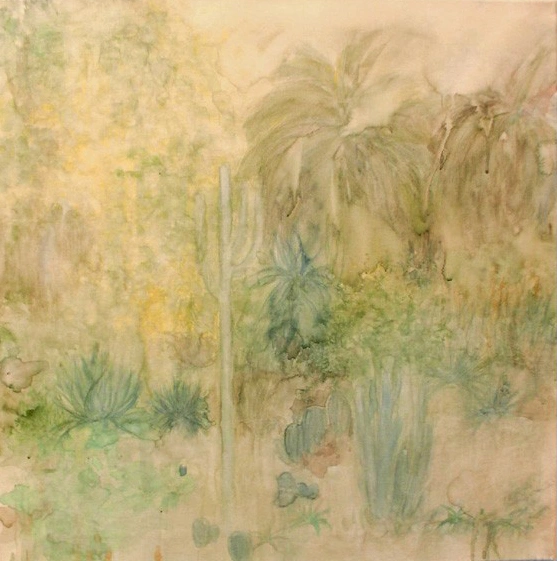
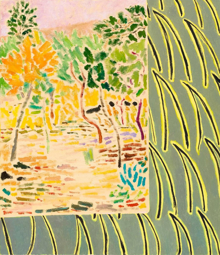
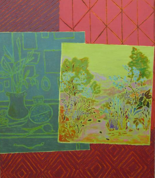
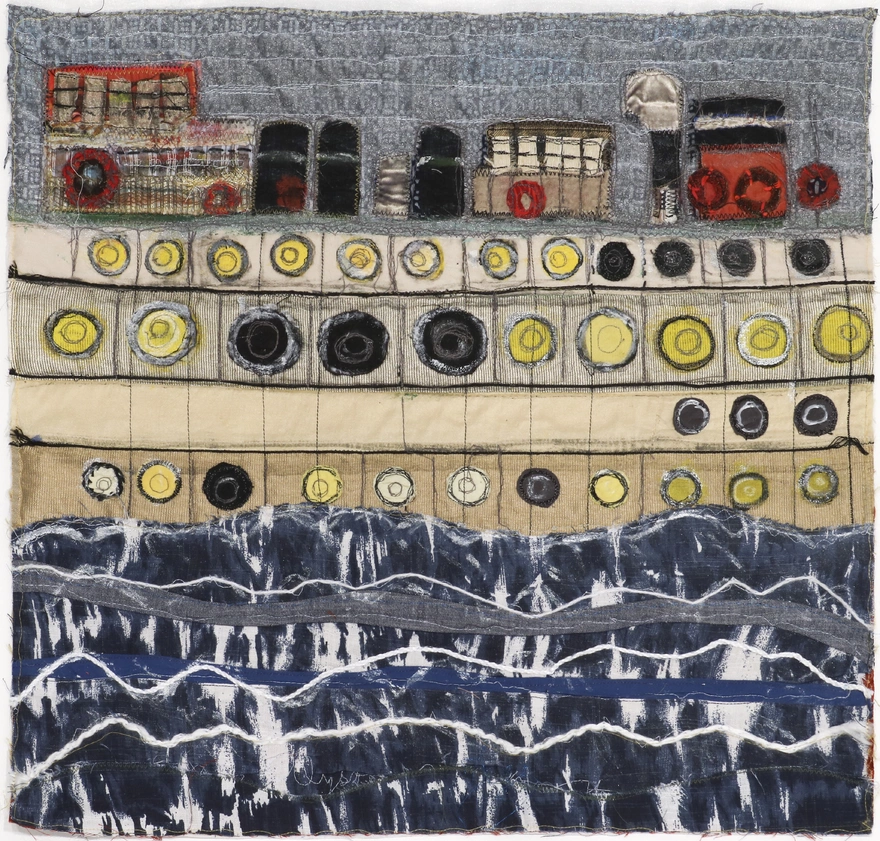
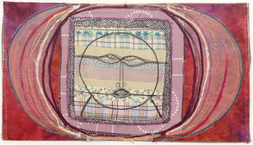
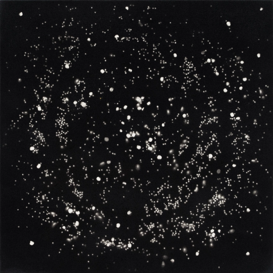
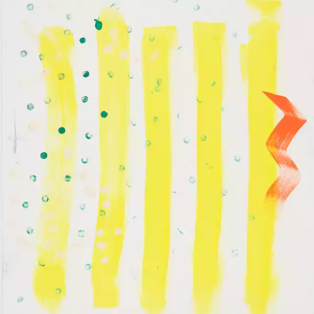
ME: Yes, landscape plays a prominent role. Roe Ethridge and Emilie Halpern are represented by photographs of the ocean. Roe is a surfer who hangs out in the Rockaways during the summer. This scene of surfers takes me away to Long Beach Island, NJ where my family always summers. Emilie’s moonscape has the word love spelled out in the moon’s reflection on the water. You just have to find it. John McAllister makes paintings with multiple landscapes within the frame, taking you to many different places all at once. Nikolai Noel’s small moonscape drawings are intimate, romantic works that take you to an island far away. Silke Otto-Knapp’s impressionistic landscapes are done with watercolor and ink on canvas; thin washes of color allow you to get lost within her desert garden. Rashid Johnson takes you to outer space. The stars are formed by spray painting over black-eyed peas and then removing the peas so that white spots representing the solar system remain. Alyson Vega transports us via ship and train into her world of sewing. It’s an outsider’s vision that is finely crafted. Lastly there is Anne Chu. This exhibition is dedicated to Anne who passed away a few months before the exhibition was planned. Anne was a great artist, gallerist, and friend who was taken away from us much too soon. She was a very influential figure in the New York art world. Rebecca and I miss her, but we are proud to be living with her work.
ES: Anne Chu’s presence in this show embodies the idea of transportation, or movement, between places/states/ideas. Chu was able to collapse notions of time, culture, and representation in her work in order to bring attention to these very ideas.
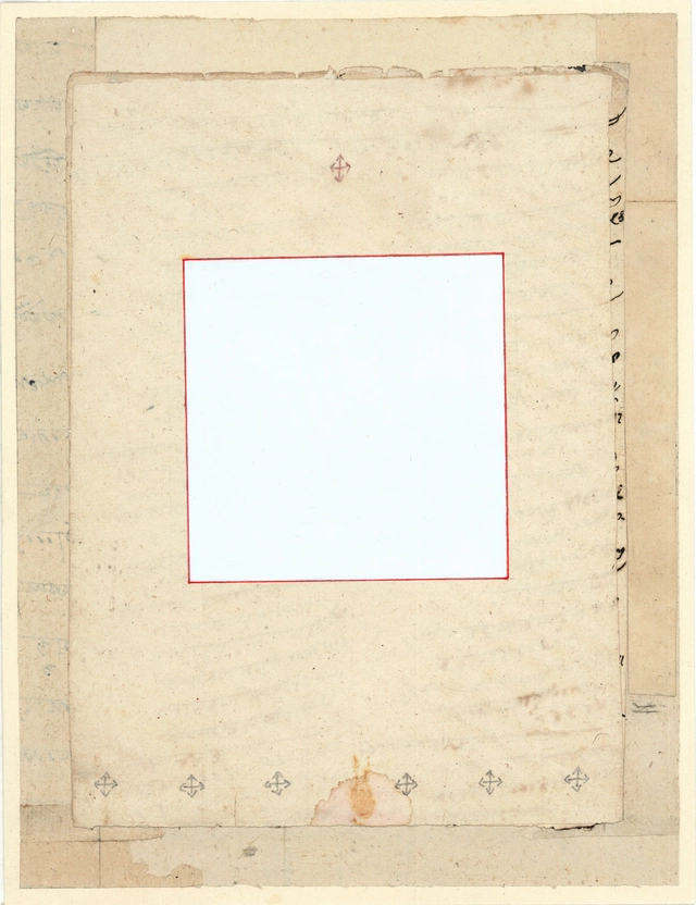
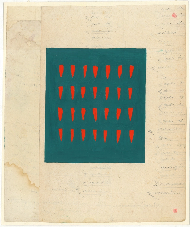
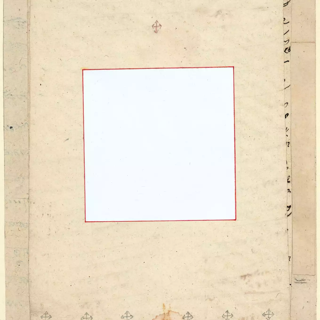
The Tantric paintings from Rajasthan, India are the only really abstract works in the show. Can you say anything about what they are and the choice to include them?
ME: Tantric drawings are made by Hindu priests in India. They do not consider these to be artworks. They are unsigned and the creators are unknown. They are made as a form of meditation, perfect for our theme of being transported.
ES: Can you say anything about why this exhibition works in this context, at Riverview School, or why you wanted to present any of these particular artworks/ideas there?
RE: It isn’t driven by what would work at Riverview. It’s really about putting together a thought provoking show that is pleasing to the eye. The Riverview teachers are able to incorporate these exhibitions into their classes. We find that extremely rewarding.
ME: The idea that art is a way of transporting you to different places and to different states of mind is an important concept for students to grasp. Once they understand that they are far more likely to want to pursue it and incorporate it into their lives. That is our end game. When you think about it that’s every curator’s end game, wouldn’t you agree Erin?
ES: Definitely – to hopefully provide a meaningful opportunity or context for your audience to engage with art works - to somehow share the artist’s ideas and your own interest in a work, in a way that will resonate with the viewer. In the case of this exhibition in particular understanding art/artistic practice as a way to immerse oneself in places, ideas etc, that are not readily available to us. This show considers how artworks can transcend time and space, and hopefully the viewers will enjoy this journey.
